Restaurant Signs and Menu Boards: How to Brand Your Dining Establishment
A chef opening her first restaurant recently described the two conversations that shaped her sign decisions most. The first was with her business partner, who argued for investing heavily in interior design and keeping signage minimal — “the food will speak for itself.” The second was with an experienced restaurant operator who had opened seven locations, who said: “No one eats food they don’t know exists. Your best dish is irrelevant until someone walks through the door, and your signs are what get them there.” She ended up investing in a complete sign program: exterior channel letters with her restaurant’s name in a custom typeface, a menu board visible from the sidewalk before entry, and interior dimensional signage that reinforced the brand identity throughout the dining space. The experienced operator was right: before anyone can experience the food, the sign has to communicate enough about the restaurant’s character and quality to create the decision to enter. Restaurant signs serve this function continuously and at zero cost per impression. This guide covers the complete sign program a restaurant needs and how to specify each element correctly.

Why Restaurant Signage Is Both a Marketing Tool and a Brand Communication System
Restaurant signage serves two distinct functions that need to be designed for simultaneously. The first is marketing — attracting and converting passing potential customers into walking-in customers by communicating the restaurant’s existence, character, and appeal quickly enough for a pedestrian or driver to make a stop decision. The second is brand communication — expressing the restaurant’s concept, quality positioning, and atmosphere through visual design language that sets expectations before a guest sits down.
Both functions operate before the guest ever tastes the food, which means signage is often the first impression that determines whether the restaurant gets a chance to deliver on its actual promise. Signs outside a restaurant that look professional, distinctive, and consistent with the dining concept the restaurant is trying to deliver create a first impression that primes guests for a positive experience; signs that look generic, dated, or inconsistent with the interior design create a credibility gap that the restaurant has to overcome before the guest’s experience even begins.
Menu boards occupy a unique position in the restaurant sign program because they serve a third distinct function: decision support. A guest at the entrance or in a queue reading a menu board is actively making a purchasing decision — what to order — and the menu board design directly affects both the ease of that decision and the restaurant’s ability to guide guests toward higher-margin items, new offerings, and upsell opportunities. Menu board design is therefore simultaneously a sign design exercise and a merchandising exercise, with measurable revenue consequences for restaurants that approach it with business intelligence rather than only aesthetic judgment.
Exterior Restaurant Signs: Getting Potential Customers to the Door
The exterior restaurant sign program typically includes several elements: a primary identification sign (most commonly channel letters or a dimensional logo sign) that identifies the restaurant from the street; possibly a secondary sign or window graphic that communicates the cuisine type, key differentiators, or hours to pedestrians approaching closely; and any roadside or monument sign elements needed for visibility from vehicle traffic on adjacent roads.
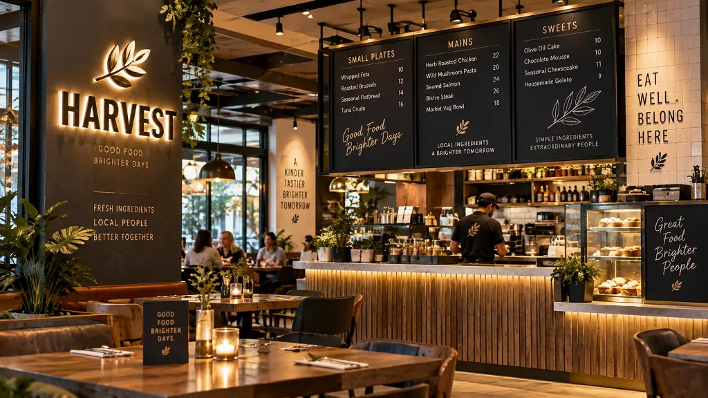
Menu billboard or menu board visible from outside — a framed menu display at the entrance or window — is one of the highest-converting exterior sign elements available to full-service restaurants, because it allows potential customers to browse the menu and decide to enter (or not) based on actual menu knowledge rather than only the exterior impression. Restaurants with visible entrance menus consistently see higher conversion from “walking past” to “walking in” than those without them, specifically because the menu browser is already sold on the concept before they open the door.
Chalkboard menu restaurant exterior applications — a chalkboard menu or specials board visible from the sidewalk — combine the functional benefit of external menu visibility with a visual character (hand-lettered, changeable, personal) that communicates the kind of casual, neighborhood-oriented dining experience that many independent restaurants want to convey. A well-maintained chalkboard exterior menu simultaneously communicates the restaurant’s personality and provides decision support — when it’s maintained and executed with skill. An unmaintained or sloppily executed chalkboard undermines the same communication by suggesting that attention to detail isn’t the restaurant’s strength.
Channel letter or dimensional logo signs are the exterior identification element that most directly communicates the restaurant’s quality positioning. As covered in dedicated channel letter guidance for this site, illuminated channel letters provide the day-and-night visibility that restaurants with evening service require, while the letter design — typeface, color, dimensional depth — communicates the restaurant’s character from a distance. A fine dining establishment’s exterior sign uses different typography, scale, and illumination treatment than a casual neighborhood bistro’s sign, even if both use channel letters as the format, because the design language communicates positioning before the guest ever reads the restaurant name.
Menu Boards: Design for Legibility and Revenue
Menu boards for restaurants serve their decision-support function when they help guests make purchase decisions quickly and confidently, and when they guide guests toward the items that are best for the restaurant’s business — not just when they display the full menu in the smallest type that fits in the available space.
Menu board design best practices from the hospitality industry are well-established: primary items should be positioned in the upper center and upper left of the board (the natural reading-start position for most viewers); prices should be displayed without currency symbols or decimal points when possible (reducing the salience of price in the purchase decision); photographs of high-value items increase order rate for those items when the photography is genuinely high quality; and category structure should reflect customer decision logic (the question “what am I in the mood for?” not “what’s on our menu?”).
Board menu readability requires adequate letter size for the viewing distance — a menu board read by guests standing three feet away can use smaller text than a drive-through menu board read from a car at 15 feet. The most common menu board legibility failure is undersizing text to accommodate more content, which forces guests to approach uncomfortably close or to ask staff what items say. Menu board content should be curated to what fits at readable size rather than expanded to fit everything at unreadable size.
Digital menu boards — LED display screens with content managed through digital signage software — provide the ability to change menu content, pricing, and imagery in real time, which is valuable for restaurants with dynamic pricing, seasonal menus, limited-time offers, or daypart menu transitions. The investment in digital menu boards is justified by content management flexibility rather than display quality (which static backlit boards match at lower cost) and is most appropriate for restaurants with genuinely dynamic content needs rather than those with stable menus who simply want a contemporary look.
Frequently Asked Questions
What types of signs does a restaurant need?
A complete restaurant sign program includes: exterior identification signs (channel letters or dimensional logo sign visible from the street), menu board or entrance menu display, any roadside signage needed for vehicle traffic visibility, interior wall signs that reinforce brand identity in the dining space, table markers and service area indicators, and regulatory signs including exit signs and ADA-required restroom identification. The specific combination and scale of each element depends on the restaurant’s concept, physical format, and customer traffic pattern.
What is the best menu board format for a restaurant?
The best menu board format depends on content stability and operational needs. Static backlit menu boards (printed or vinyl face panels in an illuminated cabinet) are appropriate for restaurants with stable menus and provide consistent visual quality at lower cost than digital alternatives. Digital LED display boards are appropriate for restaurants with genuinely dynamic content — multiple dayparts, frequent limited-time offers, or real-time availability updates. Chalkboard menus communicate a specific casual, artisanal brand character that suits certain dining concepts but requires consistent daily maintenance to perform as intended.
How important is exterior restaurant signage?
Exterior restaurant signage is the primary tool for attracting walk-in and drive-by traffic — the customer acquisition channel that requires no ongoing marketing cost once the sign is installed. For restaurants in locations with meaningful pedestrian or vehicle traffic, exterior signage is often the highest-volume customer acquisition tool the restaurant has, operating continuously at zero cost per impression. Underinvesting in exterior signage is one of the most common and consequential business mistakes in restaurant startup, as the chef’s business partner’s position — “the food will speak for itself” — demonstrates.
Can a restaurant change its menu boards without replacing the entire sign?
Yes — static backlit menu boards with removable printed face panels allow menu content to be updated by replacing the printed panel, which is significantly less expensive than replacing the entire sign structure. Digital menu boards allow content to be changed through software at any time without any physical sign intervention. Planning for menu update capability during the menu board specification process — whether through interchangeable panels or digital displays — is a practical operational decision that avoids the cost and disruption of more extensive sign work every time menu content needs updating.
Conclusion
The honest takeaway on restaurant signs and menu boards is that they’re doing revenue work whether they’re good or not — the question is whether they’re doing it well or poorly. A restaurant with strong food and service but inadequate exterior signage will underperform its potential by failing to attract the customer volume its quality deserves. A restaurant with a well-designed menu board that guides guests toward higher-margin items is consistently generating incremental revenue from every ordering interaction. Restaurant owners who understand this — who see their signs as operational tools with measurable revenue consequences rather than aesthetic decorations — consistently invest at the level that produces the returns the experienced operator described: signs that get people through the door before the food has a chance to speak for itself.

Read more

The Importance of Hard Coating in Outdoor Signage: How Polyurea Coating Transforms Foam Structures into Durable Signage
The Art of Imitation: How Faux Finishes Transform EPS Foam Into Stone, Metal & Wood

Beyond Traditional Materials: Why HDU Foam Is Replacing Wood and Stone in High-End Signage
The Hidden Science Behind High-Quality Foam Lettering & Dimensional Signage
Eco-Friendly Signage Solutions: Is HDU & EPS Foam the Sustainable Choice?

Why Lightweight Foam Monument Signs Are Ideal for Large-Scale Signage

The Importance of Proper Installation for Monument Signs

Foam vs. Metal Signs: Cost, Durability, and Aesthetic Considerations

The Importance of Proper Installation for Monument Signs

From One-Time WOW to Multi-Tour ROI
Recommended Articles
HDU Signs: What High-Density Urethane Foam Is and Why It’s a Premium Sign Choice

Acrylic Signs for Business: Types, Benefits, and How to Choose the Right Style
Industrial 3D Printing: Large-Scale Foam Prototypes, Models & Manufacturing Solutions
Molds for Stone Signs: The Foundation Behind Consistent Architectural Signage
Beyond the Booth: How Custom 3D Displays Make Brands Stand Out at Expos and Events
Sandblasted vs. Routed Signs: Which Is Right for Your Project?
Our customer reviews
Read more reviewsRead more reviews