


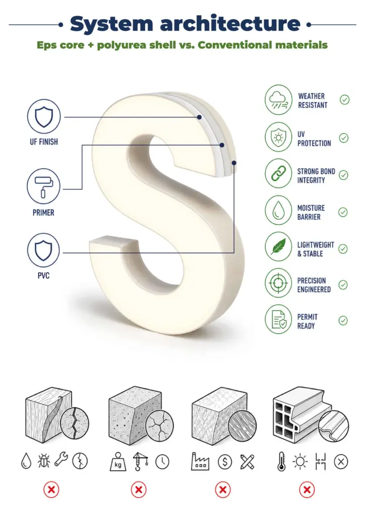
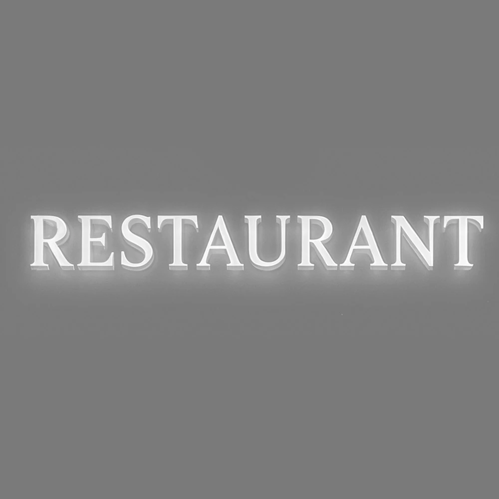
 Illuminated Letters & Logos classic model 1
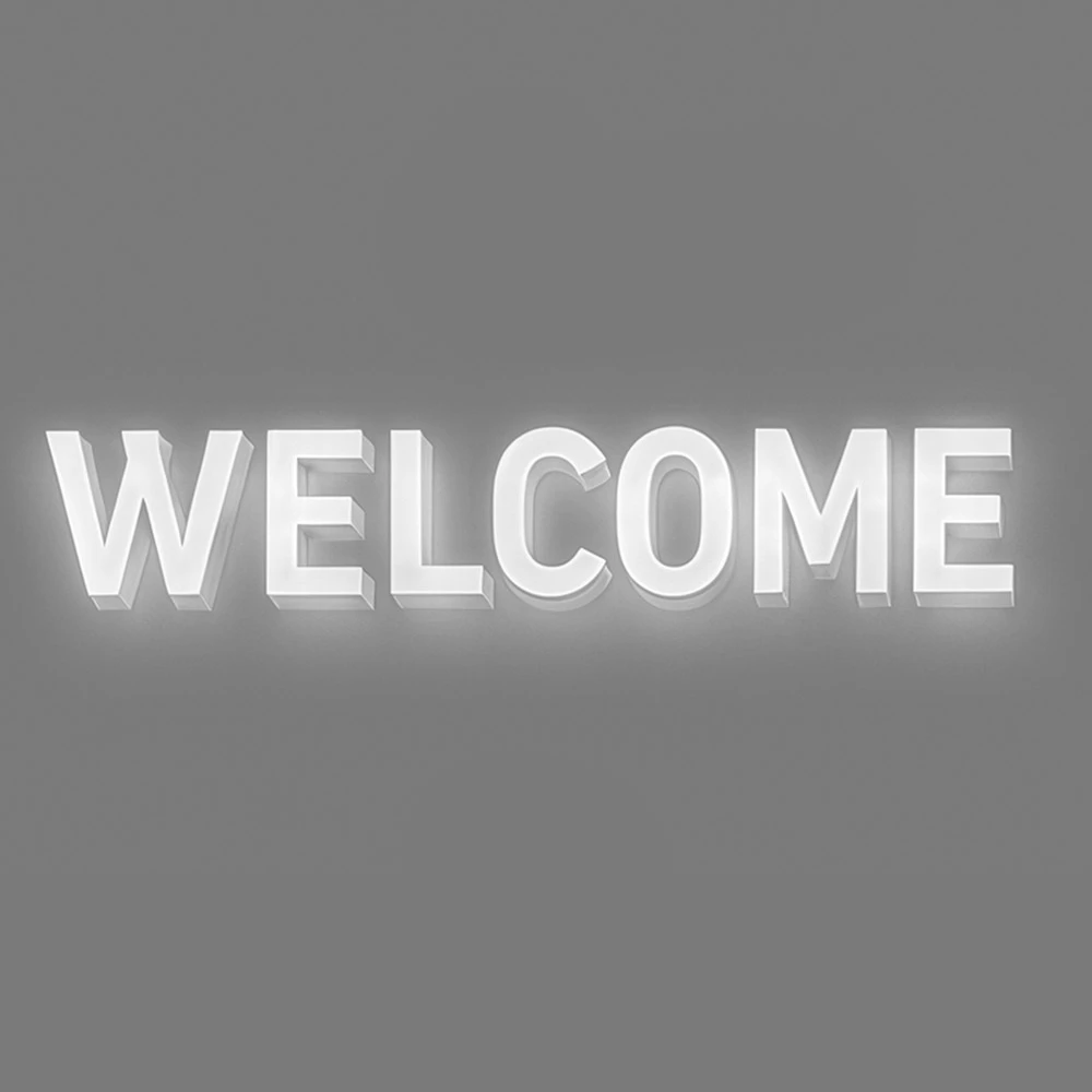 Illuminated Letters & Logos classic model 2
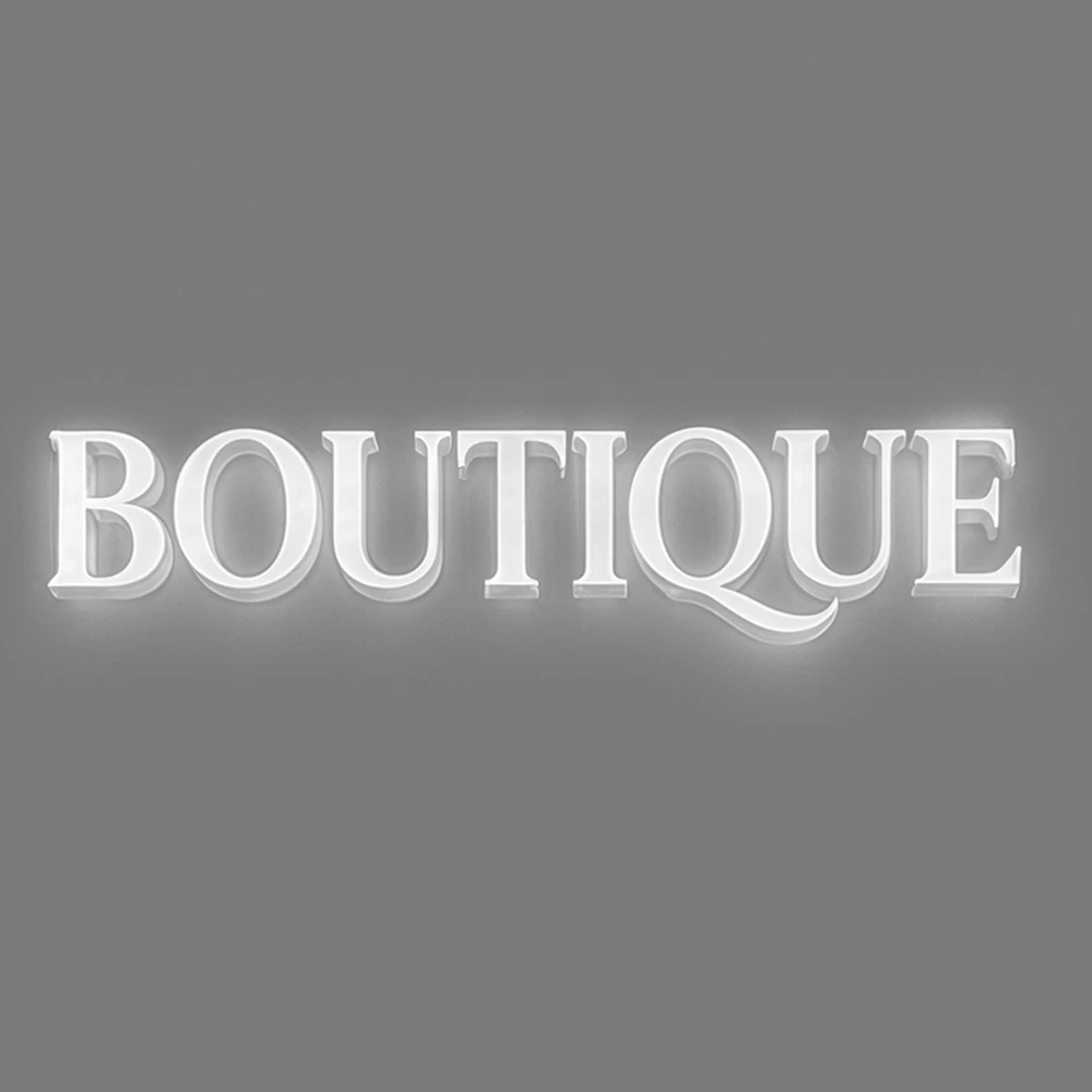 Illuminated Letters & Logos classic model 3
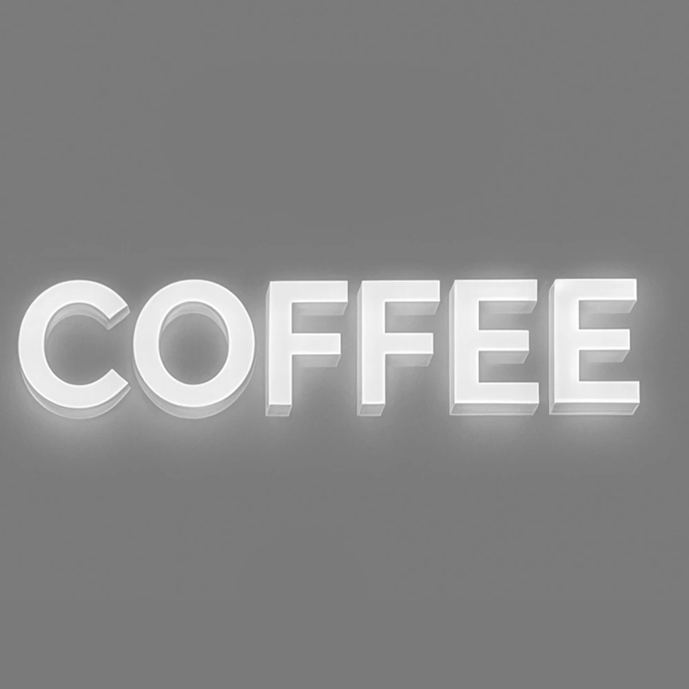 Illuminated Letters & Logos classic model 4
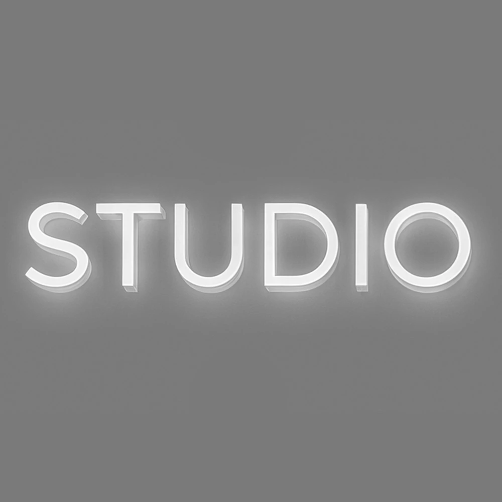 Illuminated Letters & Logos classic model 5
 Illuminated Letters & Logos classic model 6
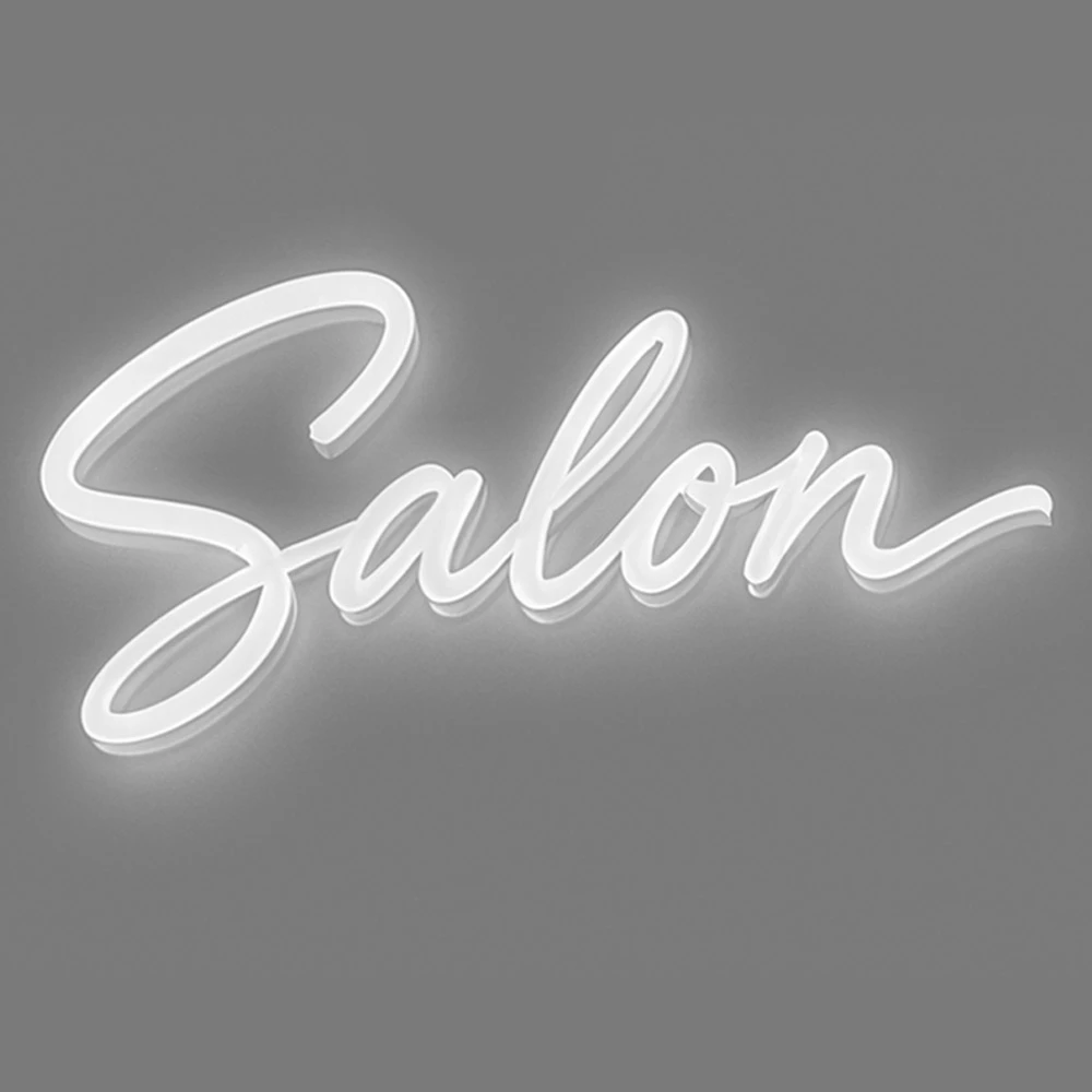 Illuminated Letters & Logos classic model 7
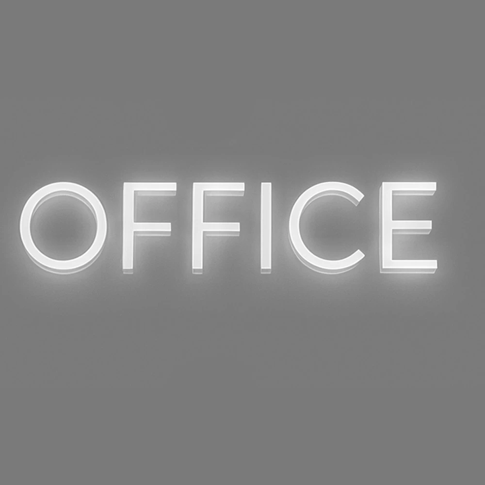 Illuminated Letters & Logos classic model 8
 Sandblast
 Freestyle
 Quarzputz
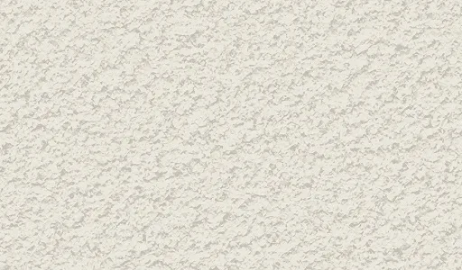 Sandpebble
 Sandpebble fine
 Mojave
 Finesse
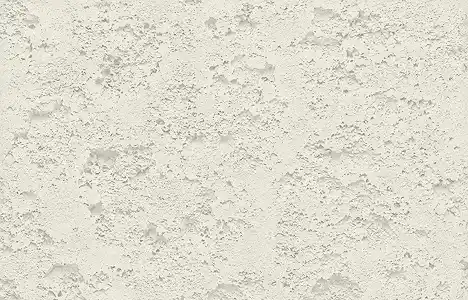 Coral
 Coral Light
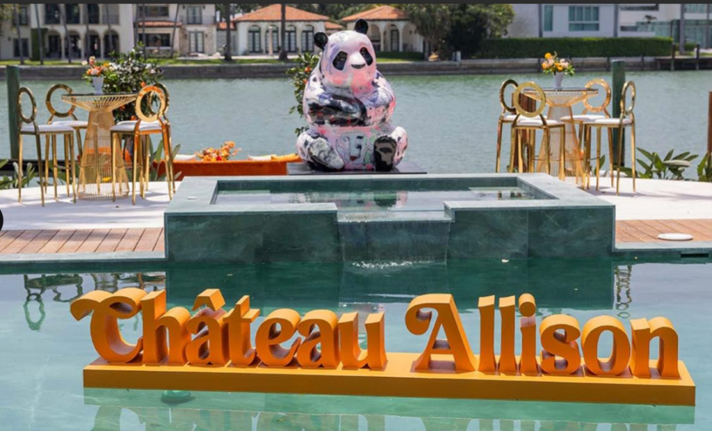

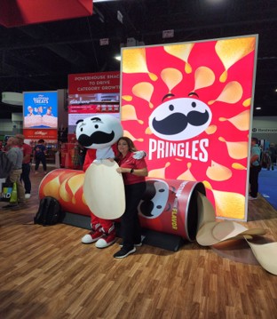

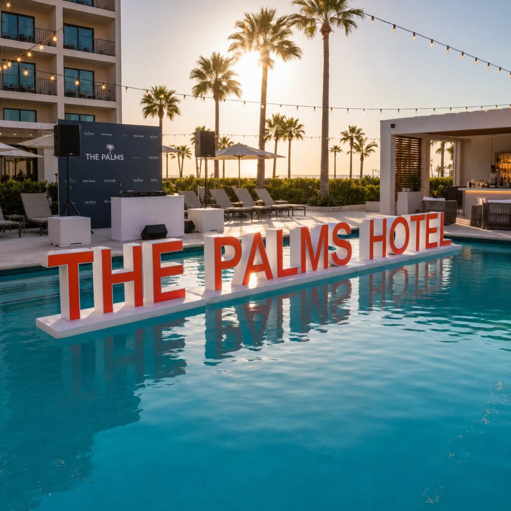

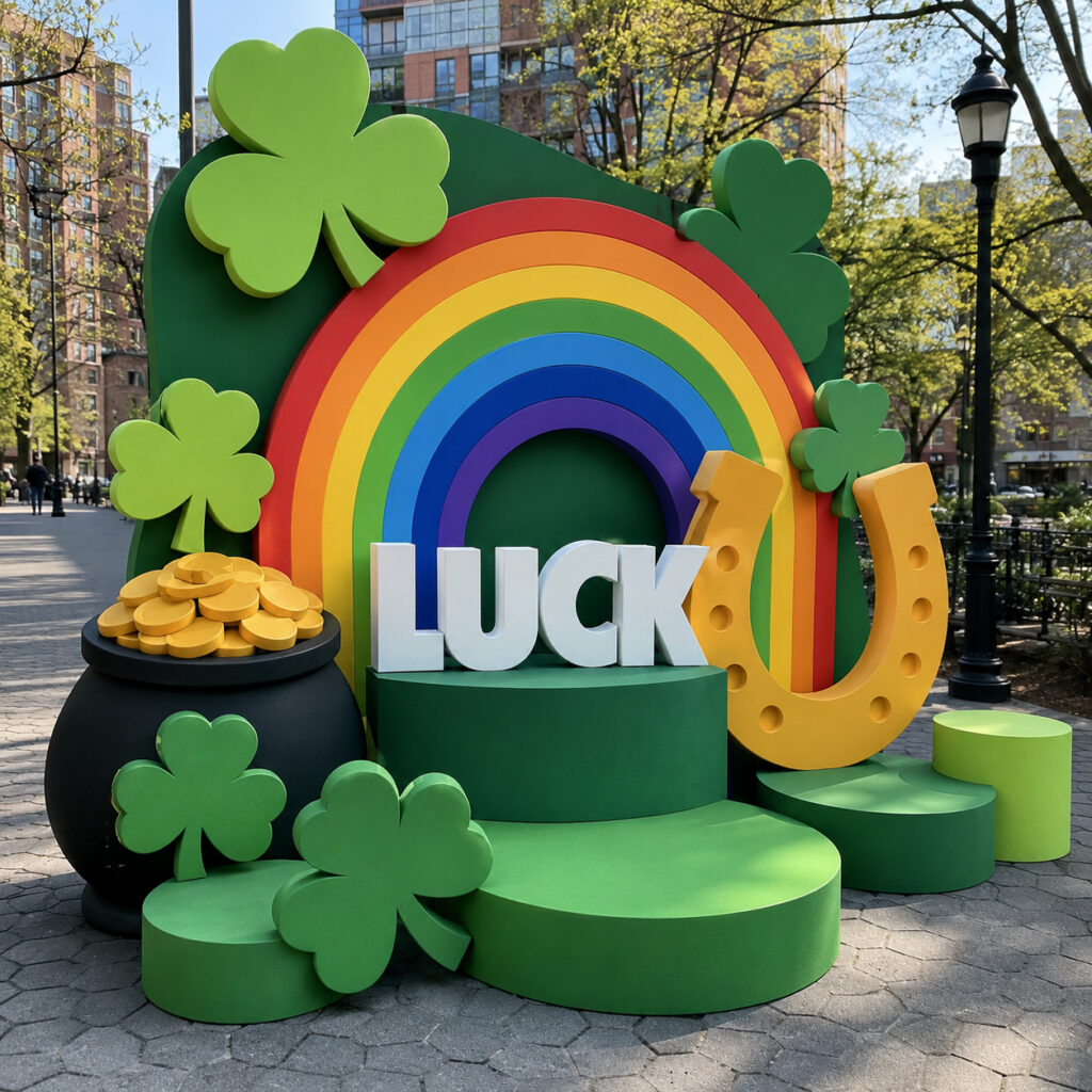
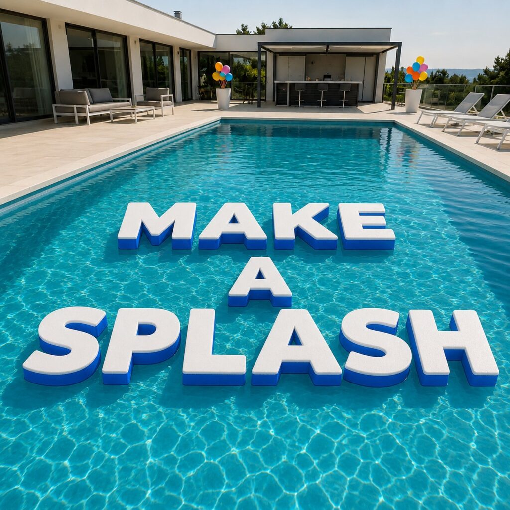



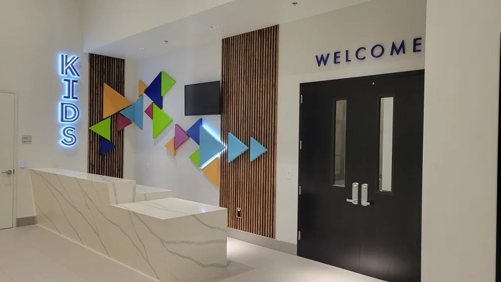
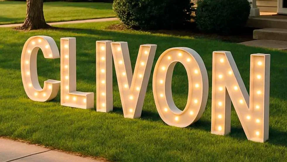

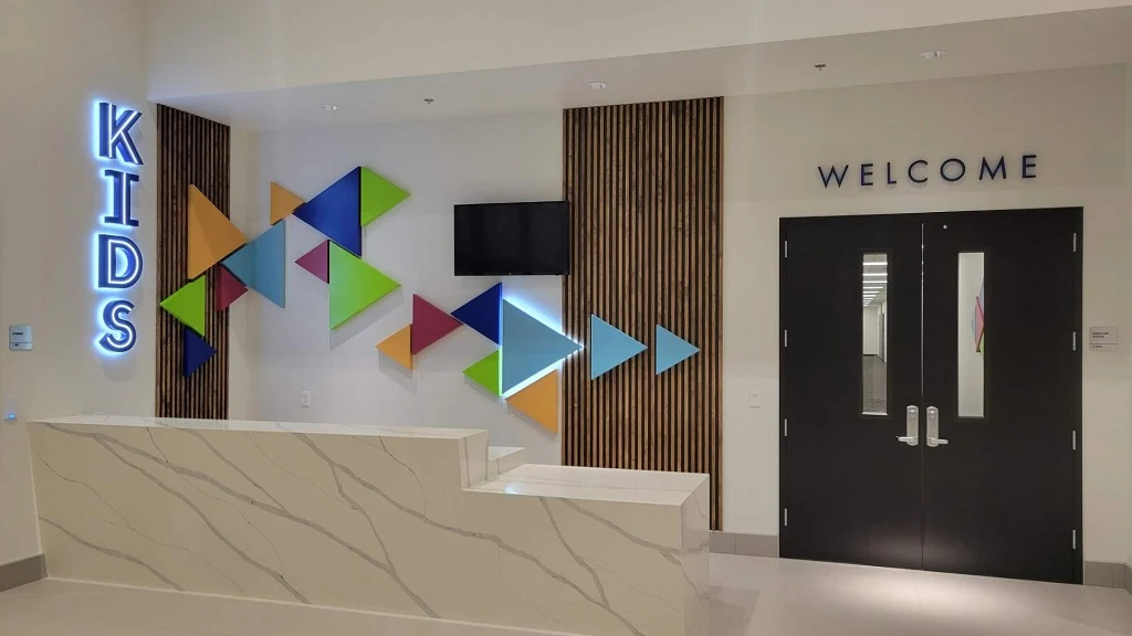

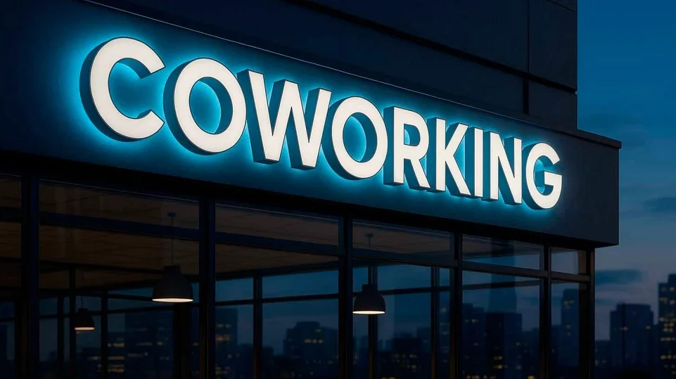

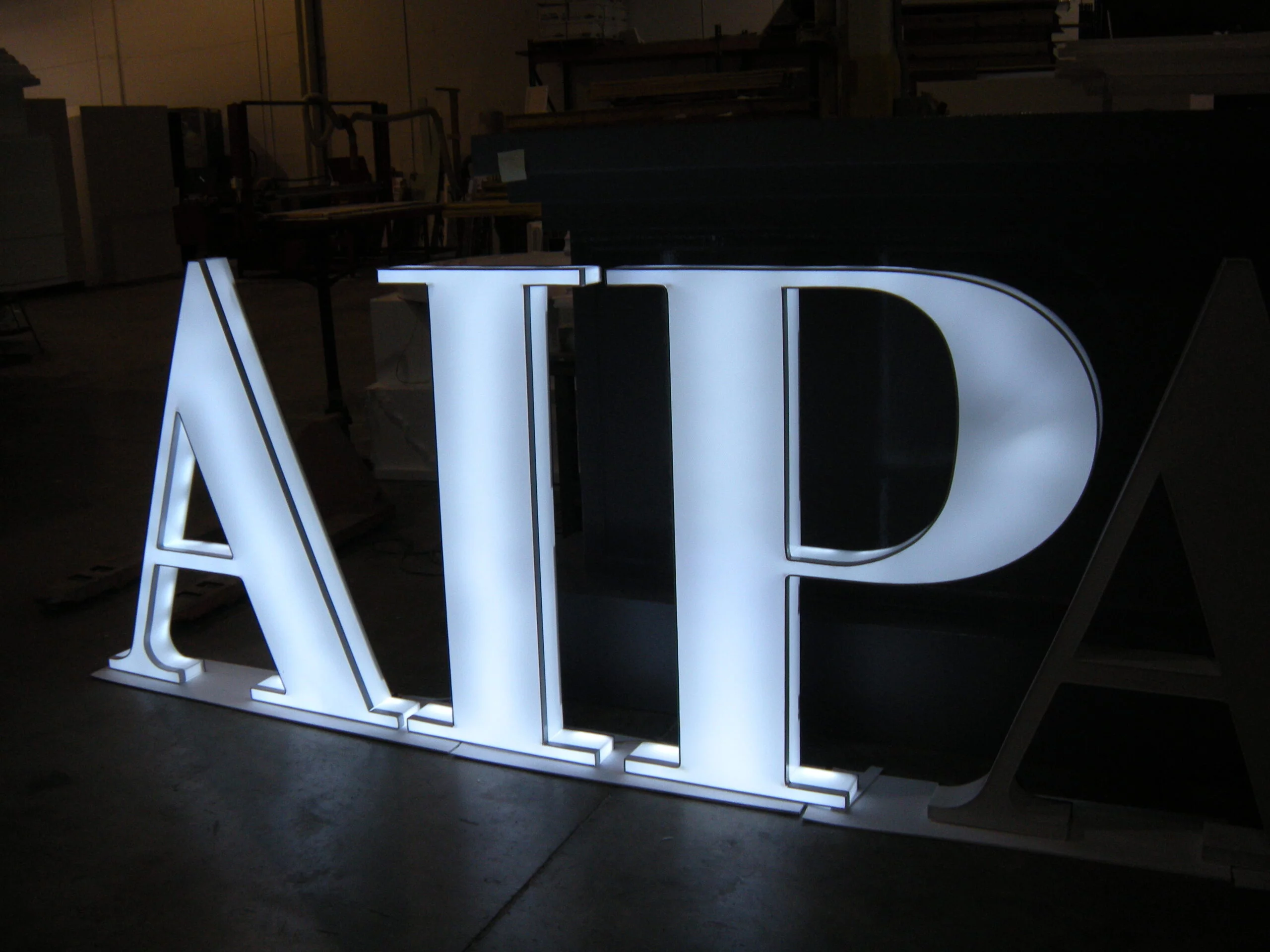
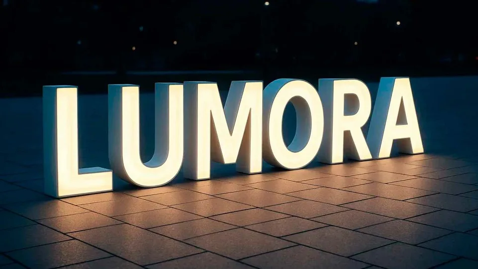
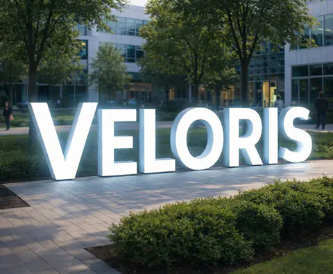
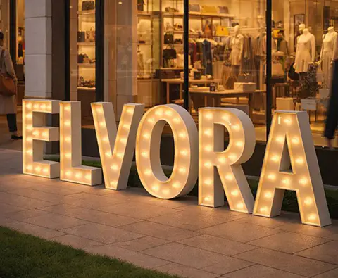
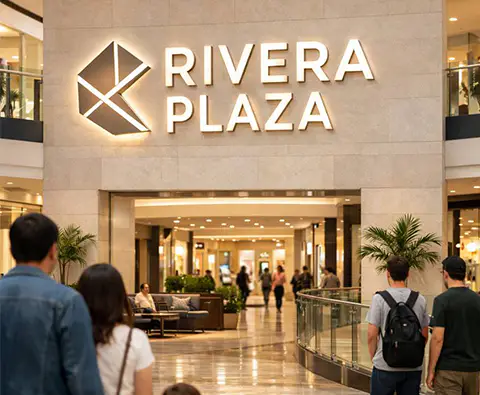
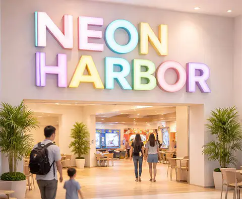
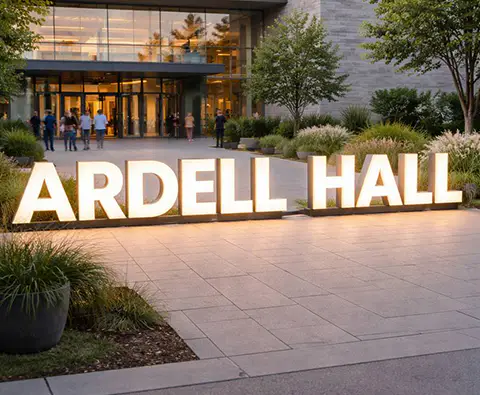

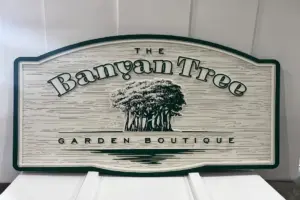
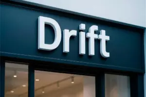
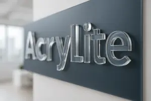
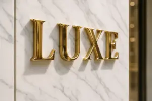
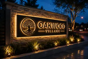



Lighted Channel Letter Signs
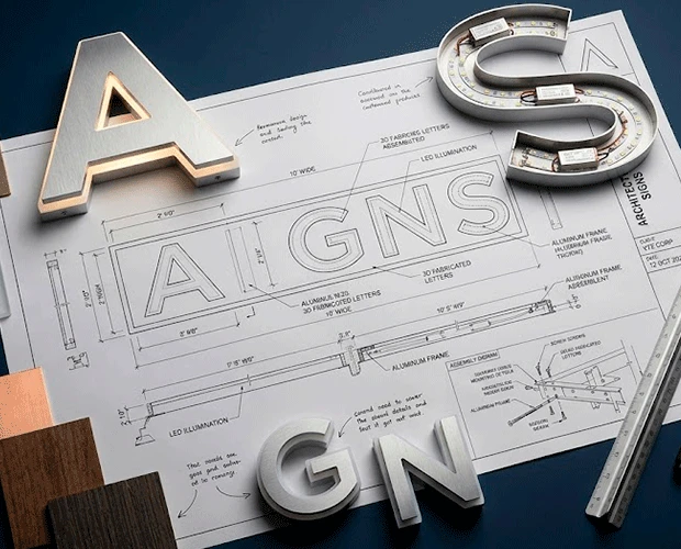
When the workday ends, your brand shouldn’t disappear with the lights. It should remain visible, recognizable, and continue working – even after the doors are closed. Illuminated letter signs — what the industry also calls custom channel letters or illuminated channel letter signs — make that possible. In the sign industry, illuminated letters and channel letters are often the same thing — dimensional, individually lit letters mounted directly to a wall or storefront, sometimes sold as complete lighted channel letter signs and installed as one channel signage package. They maintain a consistent visual identity, strengthen brand perception, and keep your business noticeable around the clock. It’s not just design of illuminated letters – it’s a functional tool that builds recognition, reinforces trust, and attracts new customers long after other signs have gone dark.
At 3D Sign Factory, we’ve seen how light can completely change the way a space feels. During the day, our illuminated letters — sometimes just wall letters with no light at all until dusk — blend into the architecture – clean, structured, part of the design. But as the sun goes down, something shifts. The same shapes start to breathe. They glow with warmth, confidence, and just enough personality to turn a wall into a statement. Alongside our custom architectural foam work on monument signs and branding installations, illuminated letters are engineered from a different set of materials entirely — aluminum, acrylic, and PVC — chosen specifically for how they carry and diffuse light.
You’ve probably noticed it too – that one storefront or hotel illuminated letter that looks different at night, almost alive. That’s not luck. That’s thoughtful design meeting precise engineering.
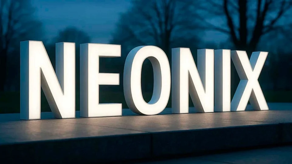
Illuminated letters aren’t just metal and LEDs. They’re the voice of a brand after hours, and the light does more than switch on — it shapes each piece, adds depth, and keeps it visible once everything else has faded into the dark.
Take a boutique hotel in Miami. They didn’t want anything flashy – just quiet elegance. We built a brushed aluminum illuminated letter A, tuned so the glow spread evenly, soft but confident. At night, its reflection danced across nearby glass towers, and suddenly, the whole street started noticing. Locals began calling it “the hotel with the glowing A.”
Then there was a small restaurant in Orlando. The owner said, “I want people to feel welcome before they even walk in.” So we built an acrylic illuminated letter M with a gentle amber halo – warm, like candlelight. Even after closing, the glow stretched down the block. The next morning, people showed up saying, “We saw it last night – we had to stop by.” Light draws attention to your brand even when you’re closed – when a passerby is simply walking home.
From tradition to technology
We’ve been in this business long enough to know – light has always had the same purpose: to draw attention to what matters. Centuries ago, artisans worked by candlelight, carefully applying gold leaf to handwritten illuminated manuscripts. Those glowing letters weren’t just art. They made words stand out and, in a real sense, gave them life. When the candle flickered and the gold caught the light, the page seemed to come alive – meaningful, deliberate, unforgettable in a way flat ink never was.
That idea hasn’t changed. We just use different tools now — LEDs instead of candles, aluminum instead of gold. The craft evolved. The goal never really did – get people to look, then feel something, then remember it.
We carry that same philosophy forward — just with new tools. LEDs instead of candles. Aluminum instead of gold. Precision engineering instead of brushstrokes. The goal hasn’t changed: to make light a medium of meaning.
When illuminated letter lights up for the first time, that’s the moment design becomes communication – the same purpose craftsmen pursued centuries ago, now achieved through modern engineering. If people still ask what are channel letters, this is the short answer: individually cut, individually lit letters — the modern, code-compliant descendant of that same idea.
The right materials for the right impact
Every material we use has a purpose.
Aluminum brings structure and endurance — perfect for outdoor environments exposed to heat, salt, and humidity. It resists corrosion, keeps a clean finish for years, and forms the backbone of every set of custom led channel letters we build.
Acrylic delivers clarity and refinement. Light spreads evenly through it, so the glow comes out smooth rather than harsh – good for interiors where illumination needs to feel soft and deliberate. That includes trimless channel letters, which skip the visible metal edge for the cleanest possible daytime look.
PVC adds flexibility. It’s lightweight but durable, which is exactly what exhibitions, events, and retail displays need when mobility and a fast install matter more than anything else.
We’re not really selling materials. What we deliver is balance. The value lies not in the components themselves, but in how light moves across each surface, how it bends, reflects, and defines space. That’s where performance meets design. An illuminated letter sign reads differently at night than a lightbox (sometimes called a seg lightbox when it uses a stretched fabric face): a lightbox glows as one flat panel, while each letter here lights on its own.
How precision becomes light
Precision defines everything. Each illuminated letter starts as a digital model, where we simulate light behavior, color tone, and reflection. Faces and returns are cut on our own cnc letters router before assembly, so tolerances stay tight across an entire set of channel letters led components. Installation is straightforward – prewired, labeled, and documented for quick, error-free setup. Maintenance is minimal: occasional cleaning and inspection. The LEDs are efficient, long-lasting, and built for continuous performance in any condition.

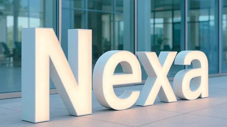

The art of form and light of illuminated letters
Uppercase and lowercase styles
Uppercase illuminated letters always make a statement – bold, structured, and confident, the kind of big letters with lights that give buildings a sense of stability and presence, which is why hotels, corporate offices, and galleries choose them so often. In downtown Tampa, we designed a tall, clean illuminated letter L for an art gallery. During the day, the letter blended seamlessly with the minimalist facade; but at night, its steady glow turned the entire entrance into a quiet landmark. It didn’t shout – it simply stood there, calm and certain, like art itself waiting to be seen.
Lowercase illuminated letters tell a different story – softer, friendlier, more personal, closer to a handshake than a salute. We often recommend this style for smaller businesses or creative studios, since it tends to read as warmer and more approachable. Shape, light, and proportion all work together here, so people feel welcome before they even step inside. That’s the kind of detail we care about: not just how a sign looks, but how it feels to stand in front of.
In Orlando, we built a small amber illuminated letter B for a cafe that wanted warmth and friendliness. Its glow spilled softly across the window each morning, and locals began calling it “the illuminated letter of good mornings.” Months later, people were still stopping to take photos of it – proof the design had become part of the neighborhood.
Serif and sans-serif styles
Serif styles tend to carry trust and heritage; sans-serif designs lean modern and precise.
For a Miami architecture firm, we built a refined illuminated letter T — subtle serifs, calm white tone, light shaped like a column. A Sarasota tech company went the other direction with a minimalist illuminated letter K: sharp, clean, futuristic. Different styles, but the result lands the same way – clarity that fits the brand.
When design learns to speak in light
Script-style illuminated letters bring a personal, expressive look to any space. They’re probably the closest thing we build to customized neon signs, just without the fragile glass tubing, and their flowing shapes add warmth and a sense of individuality.
For a coastal Florida restaurant, we produced a soft pink illuminated letter R based on the owner’s signature – refined, balanced, and welcoming.
In Atlanta, a boutique chose a sleek, curved illuminated letter S that created a sense of movement and elegance, drawing attention without distraction.
Depth that defines impact

A thin profile of illuminated letter (typically under 1 inch) creates a clean, contemporary look. It produces a tight, refined glow that outlines each illuminated letter with precision — a favorite for back lit letters where the halo matters more than the face. These are often used in high-end retail, office building signage, and architectural signage where subtlety and sophistication matter more than distance visibility.
A medium-depth profile (1-3 inches) sits in the middle: balanced brightness that works indoors and outdoors, with enough room for uniform illumination and back lit channel letters halo effects.
A thick profile (3 inches and above) gives maximum visual presence — brighter, easier to read from a distance, with a weight and authority that suits hotels, casinos, and large commercial facades.
Selecting the right depth isn’t an afterthought – it’s part of the design strategy, since it changes how light spreads, how shadows form, and ultimately how people read your brand. Done correctly, an illuminated letter isn’t just a technical specification — it’s a design decision that defines the entire visual experience.
In Georgia, a shopping center signage program installed a bold illuminated letter N – thick, strong, visible blocks away. In contrast, a St. Petersburg showroom used a slim illuminated letter E, barely half an inch deep, its light tracing a delicate, almost weightless outline. Both worked perfectly — because the depth matched the message.
Built to install. Built to last.
Each one we build is designed to make your job easier. Everything arrives ready — wiring, mounts, and detailed instructions included. No guesswork, no adjustments on site. We test every unit before shipping to ensure it performs flawlessly from the first connection.
When the lights come on, the result should feel natural – smooth, instant, exactly as planned. One client once said it best: “It just worked – like it wanted to light up.”
Upkeep is minimal. A quick wipe from time to time and a simple seal check are all it takes. The LEDs are energy-efficient, dependable, and built to keep shining for decades without dimming or fading.
Best applications
As a building signage manufacturer and channel letter manufacturer, our illuminated letter signage covers a wide range of settings:
Hotels, restaurants, and casinos
In Miami, a ten-foot illuminated letter D on a beachfront hotel glows over the ocean, drawing attention from blocks away – free advertising every night. It’s a good example of channel letter business signs done at full scale.
Reception areas and lobbies
In Sarasota, an acrylic illuminated letter H with halo lighting became the focal point of a design firm’s entrance – calm, elegant, professional.
Storefront visibility and brand appeal
Even after hours, illuminated letters keep working. In Orlando, a transparent illuminated letter I that shifted colors seasonally drew attention night after night, reminding passersby the store was worth returning to. It’s the same retail illuminated signage logic behind every storefront we build.
Events and exhibitions
Lightweight PVC illuminated letters make setup fast and flexible — the same channel sign letters approach works whether the piece ships for a single weekend or stays up for years. At a Miami trade show, a freestanding illuminated letter F glowed crisp white on stage, later moved to the lobby as a permanent brand piece.
Navigation and mixed-use complexes
In large facilities, clarity is key. In Atlanta, an aluminum illuminated letter P marks a parking entrance — bright, legible, and visible through fog and rain, part of the same commercial building signs package that guides tenants and visitors alike.
Why working with us makes sense
Made in the USA
We don’t do templates. As a commercial sign manufacturer, every project of illuminated letters at 3D Sign Factory starts with your concept, fabricated in-house through our own architectural fabrication process. One fitness studio asked for an illuminated letter V that symbolized victory – upward light, bold geometry. When it was installed, clients started taking selfies under it, hands raised. That’s design doing its job.
Smart material selection / Full technical support
We stay in the loop with your team at every stage – precise documentation, quick responses, technical support you can actually count on.
20-year warranty and proven reliability
We’re building for the long haul here. With proper care and a step-by-step maintenance guide, our illuminated letters keep their color, brightness, and precision for decades.
Light doesn’t just decorate – it defines identity. When your sign glows, your message keeps working. That’s what we deliver: light that sells, connects, and lasts. And if your project needs a fully dimensional, non-illuminated logo piece alongside your channel letters, our 3D Logo & Branding Installations team builds those too.
Request a Free Quote from 3D Sign Factory and we’ll walk through fonts, materials, and depth options before you commit to anything.
