By Dmytro Ignatyshch ·
PVC Letters and Logos for Business Signage: Durable, Lightweight, and Fully Customizable
A boutique owner types “vinyl letters near me” into her phone because the old window lettering is lifting at the corners, and she wants something on the facade that will still look right in ten years. What she needs probably isn’t vinyl at all. Alphabet signs cut from PVC sheet are the workhorse of storefront signage, and they get less attention than acrylic or lit channel letters despite being the sensible pick for plenty of businesses.
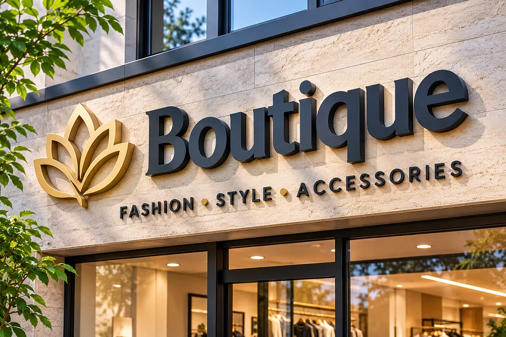
What PVC Letters Are, and What They’re Not
PVC dimensional letters are cut from rigid, closed-cell foamed PVC sheet, then painted, finished, and mounted a short distance off the wall. They’re solid and flat-faced, typically between a half inch and two inches thick. They’re not hollow shells with lights inside, which is what separates them from channel letters.
That difference drives the price. PVC dimensional letters are solid, flat-face cut letters, typically ½–2 inches thick, while channel letters are hollow metal or acrylic shells that can be internally illuminated — PVC letters are usually more affordable and faster to produce. For a daytime business, such as a dentist, accountant, or boutique, PVC with a couple of spotlights is often plenty. Restaurants and bars that live after dark may justify channel letters, with the extra electrical work and permits that come with them.
Thickness changes the character. Half-inch letters give subtle depth for small signs, one inch is the storefront standard, and an inch and a half to two inches gives a bold presence for large signs. Thicker letters cast more shadow, but they weigh more and need stronger mounting.
Think about what the lettering has to do for the building. A shop on a busy road needs a name that carries across four lanes, which means tall, simple letters in a typeface without fussy details. A professional office on a quiet street can use something more refined, with thinner strokes and a classic serif. Pick the typeface first, because it decides how much room the sign needs and how it will read at a distance.
Thickness changes the personality. Thin cut shapes sit close to the wall and read as sleek, while thicker pieces, often a half inch to an inch, cast a shadow and look more substantial. Painted edges in a matching color blend in, and a contrasting edge adds a subtle outline when the sun hits the sign from the side.
If you’re matching an existing brand, bring the exact color codes. Printed samples and screen colors never agree, so ask for a paint chip or a painted sample piece before the full set goes to the shop.
Spacing between characters is the detail that makes a sign look professional. Even gaps that look correct on a screen can read as uneven once the letters are on a wall, because round shapes like O and C need to sit slightly closer than straight shapes like H and L. Ask the shop to adjust the kerning by eye and send you a layout photo before cutting, and request a paper template for the installer.
PVC Versus Vinyl, and When Each Wins
Search for vinyl signage near me and you’ll get decals, which are cheap, quick, and fine for a temporary promotion, a pop-up shop, or a rental space where you can’t drill. A custom vinyl letter on glass lasts a few years before the edges lift and the color fades. PVC letters on a wall stay put, can be repainted, and look much the same after a decade if the finish is kept up.
The real question is how long the sign has to live. Under two years, vinyl decals letters make sense. Over five, think dimensional. A hybrid often works best: PVC for the business name on the facade, vinyl for hours, phone numbers, and seasonal messages on the glass.
Paint options give PVC more range than people expect. Flat color can match a brand exactly, brushed and metallic finishes imitate aluminum or brass, and layered builds in contrasting colors add depth. Use exterior-grade paint every time. Interior paint chalks and fades outdoors within a season or two.
Cost and lifespan separate the two options more than looks do. Adhesive vinyl is cheap and quick, and it makes sense for a short lease, a seasonal promotion, or a first sign for a new business. It does fade, peel, and crack at the edges after a few years of sun, and removing it can leave residue on the wall.
PVC lettering costs more up front, but it can last a decade or more with little attention, and a good set can be repainted if you rebrand. Over ten years, the cost per year of the sturdier option is often lower, especially once you count the labor of replacing film. If you expect to move, though, remember that cut pieces are tied to the original wall pattern, so you’ll need a template to reinstall them.
A hybrid approach works well for many shops. Use solid letters for the name over the entrance, and add vinyl for hours, phone numbers, and window messages that change often.
Ask about samples before you commit to a full order. A single letter in your chosen color and thickness costs little, and it shows the texture, the edge, and the sheen. Hold it against the wall in morning and evening light, and ask the person who will hang the sign to test the mounting method on the same piece.
Mounting, Templates, and Installation
How a sign mounts matters as much as the sign. Stud mounting uses threaded studs glued to the back of each letter and set into drilled holes through a template. It’s the most common method and leaves a slight shadow gap. Adhesive mounting with VHB tape or construction adhesive works on smooth surfaces like glass and flat metal. Raceway mounting attaches letters to a metal channel that mounts to the wall, which helps on brick or irregular surfaces and hides wiring. Panel mounting fixes the letters to a backing plate that hangs on the wall.
Photograph the wall before ordering. Brick, stucco, glass, and metal panels each call for different hardware, and your installer can tell you what’s needed from a picture. Insist on a full-size template. Missing templates are the most common reason signs go up crooked.
Alphabet signs read best with simple fonts, because thin strokes can snap during shipping or a ladder bump. Contrast matters as much as typeface: dark letters on a dark wall disappear.
Surface preparation decides how long the sign stays up. Clean the wall with a mild degreaser, let it dry, and check it with your hand for dust or chalky paint. Smooth surfaces like glass, metal, and sealed tile accept adhesive well, while rough stucco, brick, and old paint need mechanical fasteners and a shop that knows which ones to choose.
Mark your layout with painter’s tape and a level before you touch a drill. Step back and look from the street. Letters that are even a quarter inch off can look crooked when you see the whole word. A paper template with registration marks makes spacing easy, and it’s worth paying for if the layout has more than a few characters.
Weather matters for adhesives. Most need temperatures above fifty degrees and a dry surface for the first day. If you install in winter, plan for a heated space or wait for a warm window. Use a bead of silicone behind each letter in places where rain may run down the wall.
Maintenance for these pieces is minimal. Rinse them with a hose a few times a year, wipe off dirt with a soft sponge, and skip abrasive pads that scratch the paint. If one piece is damaged, ask the shop to reproduce just that character in the same color. Keep your original order number and color codes in a safe place so the replacement matches the rest of the set.
Where PVC Letters Fall Short
PVC is moisture-resistant and UV-stable when painted with exterior finishes, but it’s still a plastic. It expands and contracts with temperature, so long runs of letters need installers who allow for slight movement. Dark paint on a hot south wall heats up more than light paint, and in extreme heat thin pieces can warp. It isn’t impact-proof either: a truck bumper will damage it, and in busy loading areas a metal sign may be the better call.
It won’t glow. If night visibility is the point, PVC needs external lighting or a different product. It also won’t carry the carved, textured look of HDU foam, or the crisp polish of acrylic indoors. And in coastal or humid regions it’s actually a strong choice, since it doesn’t rust or rot the way steel and wood do.
Costs depend on letter size, thickness, number of characters, and finish. Standard orders usually take a few days to a couple of weeks. To keep the price sensible, use simple fonts, limit tiny details, and choose standard colors. Ask what’s included: hardware, templates, packaging, and installation guidance.
A quick note on search habits. Plenty of owners type vinyl letters near me or vinyl signage near me and end up with a local shop that only does decals, so say up front if you want dimensional work. A custom vinyl letter is perfect for a window schedule, but vinyl decals letters stretched across a whole facade rarely hold up. Ask any shop for photos of PVC installs that are three or more years old.
A few honest limits are worth knowing. Plastic lettering is lightweight and sturdy, but it isn’t indestructible. A strong impact from a ladder, a delivery truck, or a stray ball can crack it, and replacements need to match the original color and thickness. Keep that in mind in loading zones and playgrounds.
Fire codes sometimes apply to interior signs in public buildings, and some malls and landlords restrict what you can attach to the facade. Check your lease and local sign ordinances before ordering, since a mistake can mean removing a finished sign. Permits are often required for permanent exterior lettering above a certain size.
Finally, remember that signs age. Even the best material needs a wash once or twice a year, and a bright color may fade slightly over the first few seasons. If your brand colors are critical, schedule a quick inspection every spring and touch up any spots the sun has hit hardest.
3dsignfactory.com produces PVC, acrylic, foam, and metal letters and logos for businesses, offices, and retail spaces, with design support and nationwide shipping. Request a quote with your artwork and a photo of the wall, and they’ll recommend a thickness and mounting approach.
Frequently Asked Questions
What is the difference between PVC letters and channel letters for a storefront?
PVC dimensional letters are solid, flat-face cut letters, typically ½–2 inches thick, while channel letters are hollow metal or acrylic shells that can be internally illuminated – PVC letters are usually more affordable and faster to produce.
How thick are typical PVC dimensional letters for business signage?
Common thicknesses range from ½ inch to 2 inches; thicker letters cast more shadow and create a more substantial 3D appearance.
Can PVC letters be used in outdoor sign applications?
Yes – PVC is moisture-resistant and UV-stable when painted with exterior finishes, making it a reliable material for outdoor-facing business signage.

Read more

The Importance of Hard Coating in Outdoor Signage: How Polyurea Coating Transforms Foam Structures into Durable Signage
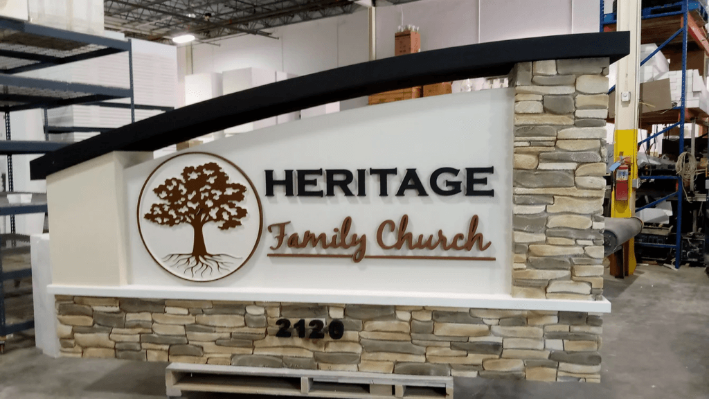
The Art of Imitation: How Faux Finishes Transform EPS Foam Into Stone, Metal & Wood

Beyond Traditional Materials: Why HDU Foam Is Replacing Wood and Stone in High-End Signage

The Hidden Science Behind High-Quality Foam Lettering & Dimensional Signage
Eco-Friendly Signage Solutions: Is HDU & EPS Foam the Sustainable Choice?

Why Lightweight Foam Monument Signs Are Ideal for Large-Scale Signage

The Importance of Proper Installation for Monument Signs

Foam vs. Metal Signs: Cost, Durability, and Aesthetic Considerations

The Importance of Proper Installation for Monument Signs

From One-Time WOW to Multi-Tour ROI
Recommended Articles
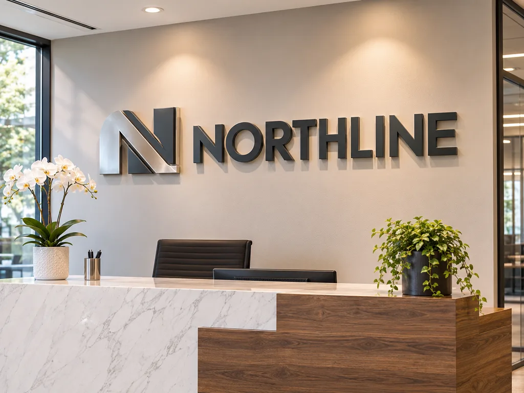
3D Logo Signs for Lobbies and Offices: Choosing Material, Thickness, and Mounting
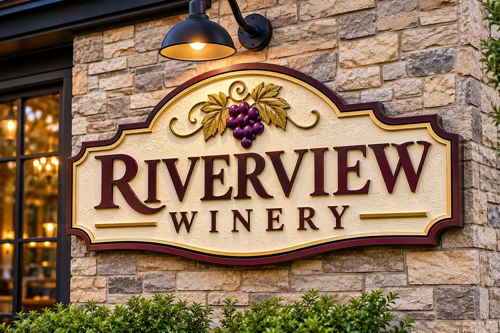
HDU Signs: What High-Density Urethane Foam Is and Why It’s a Premium Sign Choice
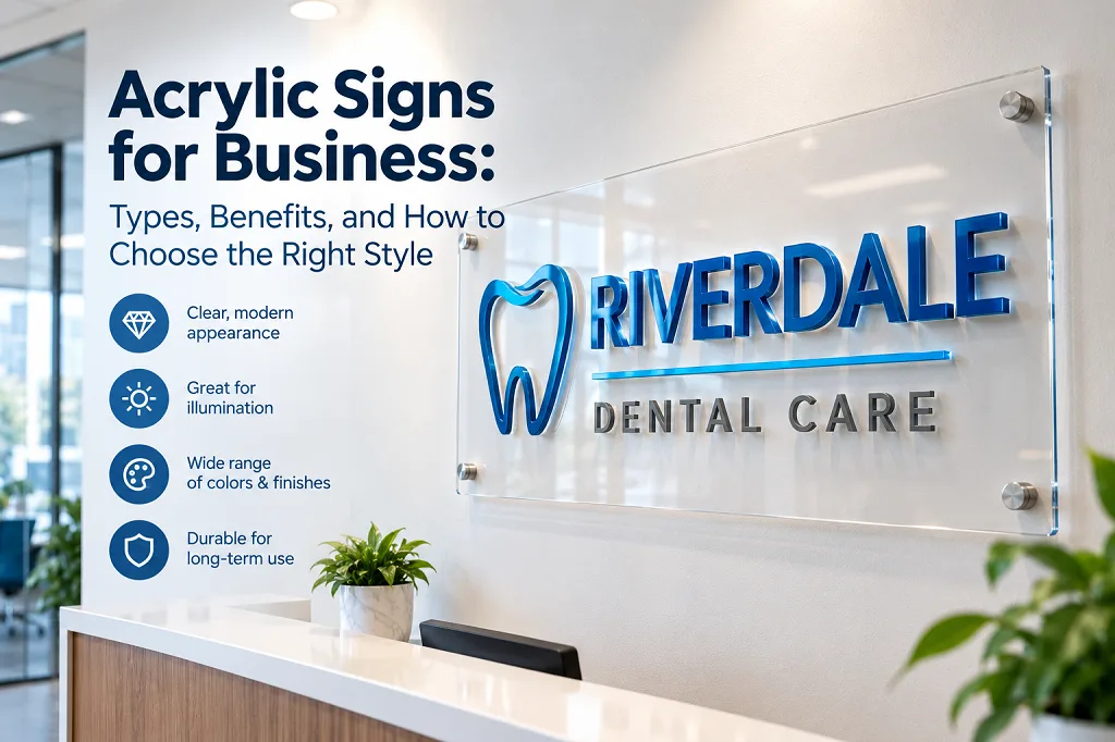
Acrylic Signs for Business: Types, Benefits, and How to Choose the Right Style
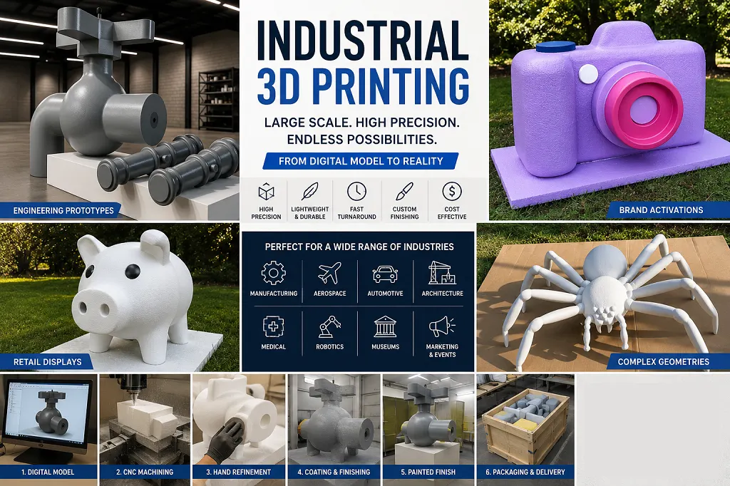
Industrial 3D Printing: Large-Scale Foam Prototypes, Models & Manufacturing Solutions
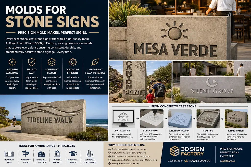
Molds for Stone Signs: The Foundation Behind Consistent Architectural Signage
Beyond the Booth: How Custom 3D Displays Make Brands Stand Out at Expos and Events
Our customer reviews
Read more reviewsRead more reviews