By Dmytro Ignatyshch ·
3D Logo Signs for Lobbies and Offices: Choosing Material, Thickness, and Mounting
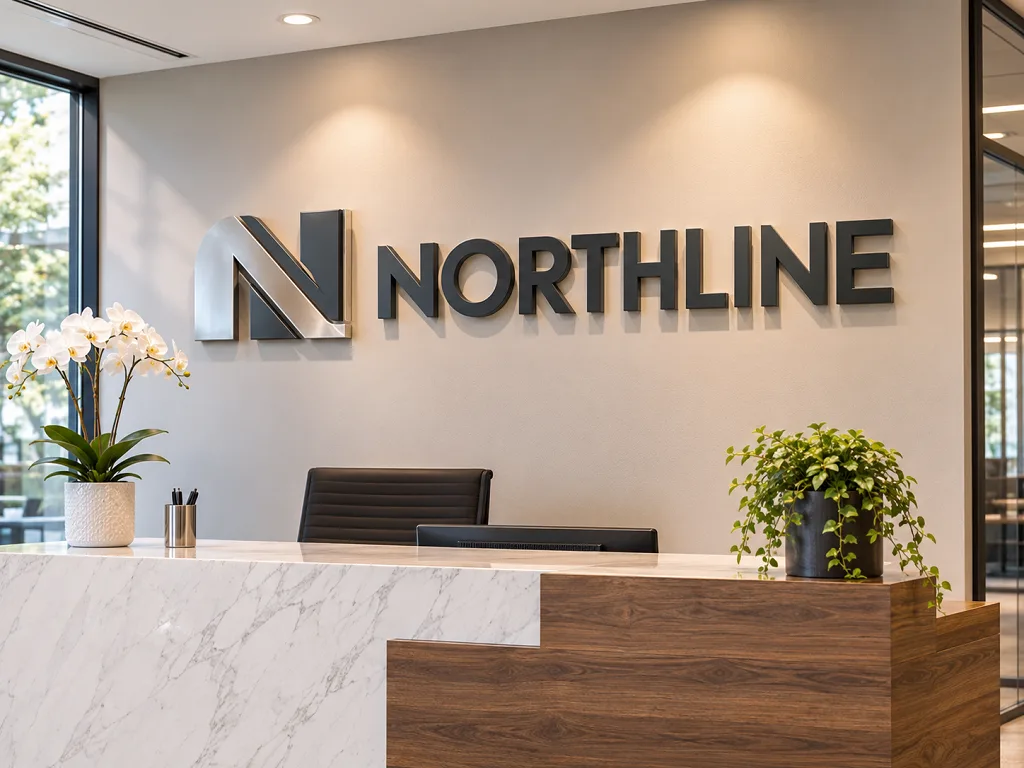
Visitors judge a company in the first thirty seconds in the lobby, and most of that judgment lands on one wall. A flat vinyl logo behind the reception desk says “we ordered this online.” A thick, crisp 3d logo sign that casts a shadow in the afternoon light says the business is established and pays attention to detail. The difference is often a few hundred dollars, and it shows up every day the doors are open.
Materials and Formats: What a Dimensional Logo Can Be Made Of
The category covers more than people expect. Acrylic is the glossy, glass-like option that takes color well and cuts to sharp edges. PVC foam board, sometimes called Sintra, is matte, lightweight, and easy to paint. High-density urethane foam can be carved into layered, sculpted forms with texture. Brushed metal, in aluminum or stainless steel, gives a corporate, machined look. Wood suits warm, craft-oriented brands, and mixed-material signs combine, say, a metal outline with an acrylic face.
Format matters as much as material. Flat-cut letters are cut from sheet stock and mounted directly on the wall, giving a clean, modern profile. Stacked letters have multiple layers for added depth, such as a white face over a black backer. Reverse-channel and halo-lit letters have light sources behind them, so the wall glows around the characters. Face-lit letters glow from the front and read well in dim spaces.
For a lobby, the choice often comes down to light and distance. Reception areas with strong overhead lighting can do without illumination, and a thick matte letter in a dark color reads beautifully. Dim lobbies and waiting rooms benefit from a backlit sign, which draws the eye and gives the room a glow. Think about where people sit, too. A reception wall sign behind a desk is seen from across the room and from the seating area, so it should be legible from at least fifteen feet away.
If your logo has many fine details, such as thin lines or tiny text, the shop may simplify it for cutting. Ask to see a proof. A good designer knows which details survive and which need a small adjustment. You can keep the small text on the printed brochure and let the sign carry only the mark and the name.
Brand consistency starts with the logo file. Send a vector version, not a screenshot or a photo of a business card. Vector files, saved as AI, EPS, SVG, or PDF, let the shop cut the shapes cleanly at any size. If you only have a low-resolution image, expect a redraw fee and a few days of delay. While you’re at it, collect your brand colors in a style guide or at least a list of Pantone numbers. A lobby logo sign that matches the colors on your website and your business cards looks deliberate, and one that’s off by a shade looks like an afterthought.
Think about what the logo looks like when it’s reversed. A dark logo on a light wall can be flipped to white on a dark wall, and the shop can show both options on a proof.
Comparing Options: Letters, Panels, and Plaques
There are three common approaches to an office wall logo. Individual letters mounted straight onto the wall give a custom look and let the wall color show through. They require careful alignment but suit almost any space. A solid panel, with the logo applied to a backing board, is easier to install and move, and it protects the wall from drilling. A plaque or framed sign works well for smaller offices or entrances.
Letters win when the wall has texture, such as brick, wood, or fabric, because they don’t need a flat backing. Panels are better when the wall is uneven or when you might move offices and want to take the sign with you. Plaques suit professional services, such as law firms, clinics, and accountants, where a refined, understated look matters.
Weight and handling vary. Acrylic and PVC letters are light enough for adhesive mounting on many surfaces. Metal letters need mechanical fasteners and should be installed by a pro. Large wood or foam pieces may need a hanging rail or cleat. Ask your supplier for the weight of the finished sign and the hardware options before you decide.
Cost follows complexity. Simple flat-cut letters in one color are the most affordable. Layered, painted, or lit signs cost more because of extra labor and parts. A sensible plan is to choose one feature that matters most, such as thickness or lighting, and keep the rest simple. Dimensional letters at half an inch to one inch thick give good depth without driving the price up.
Wall color deserves a careful look. A white wall shows off dark letters and softens bright ones, while a deep navy or charcoal wall makes white, brass, and metallic letters pop. Textured walls, such as brick or reclaimed wood, add character but compete with fine details, so bolder shapes work better. Painted drywall is the easiest background. A good office wall logo reads clearly from the door, so test it by standing at the farthest point in the room and checking whether the name still registers.
Natural light shifts through the day. A glossy surface may glare at noon and disappear at dusk, so ask for a matte or satin finish when windows face the sign. Add a small spotlight or wall washer if the wall is dim.
Sizing and Mounting: From Template to Finished Wall
Start with the wall, not the logo. Measure the width and height of the space, and note anything that interrupts it: outlets, windows, art, and light fixtures. Take a photo straight on. Place the logo as a rough shape on the photo and look at the proportions. A sign that fills about half to two-thirds of the width of the wall usually looks balanced. Leave generous empty space around it, because crowding makes a logo feel smaller.
Height is the next question. Most lobby signs sit between six and eight feet from the floor to the center of the logo, so people see it from a seated or standing position. If there’s a reception desk, align the sign so that it’s centered above the desk or slightly higher. Use painter’s tape or a paper template to check the placement before drilling.
Mounting choices depend on the surface. Stand-off hardware, the small metal barrels that hold letters a half inch off the wall, creates a floating effect with shadow. Flush mounting, with adhesive or hidden pins, keeps the profile tight. On glass, use double-sided mounting tape or adhesive designed for glass. On brick or concrete, use anchors rated for the weight and drill with a masonry bit.
Ask the shop for a template. A paper pattern with registration marks lets your installer position each letter exactly and drill holes in the right places. It takes a few minutes and prevents costly mistakes. If you hire a professional installer, share the drawing and the hardware list ahead of time so the visit goes smoothly.
Lighting options deserve their own comparison. Halo-lit letters glow around the edges and give a luxurious, floating look, especially on dark walls. Face-lit letters glow through the front, which suits bright brand colors. Edge-lit acrylic shows a thin line of light and fits a sleek, modern office. LED technology keeps the power draw low and the heat down, and the modules last tens of thousands of hours.
Power has to reach the sign. Plan for a low-voltage transformer in a ceiling or behind the wall, and let an electrician route the wire. Dimmers help with mood, and timers keep the sign on during business hours only. If you can’t open the wall, battery or plug-in options exist, though cords can look messy.
Limits and Mistakes to Avoid
Even a good sign can disappoint if the planning is weak. A common mistake is choosing a color that disappears into the wall, such as a gray logo on a gray wall. Another is ignoring light. A glossy sign can reflect windows and ceiling fixtures, hiding the logo. Matte finishes avoid glare. Test a sample at the actual location and at different times of day.
Think about the wall itself. Drywall can carry light signs with proper anchors, but heavy metal letters may need backing studs. Some leased spaces restrict drilling or require approval for changes. Check your lease and talk to the property manager before ordering, and ask about the restoration requirements when you move out.
Scale mistakes are common. A logo that’s too small gets lost, and one that’s too large overwhelms the room. Print the layout at full size, tape it up, and live with it for a day. If your logo includes a long name, consider stacking it on two lines to improve readability.
Maintenance is easy. Dust with a soft cloth, wipe with mild soap and water, and avoid ammonia cleaners on acrylic. If a letter is damaged, the shop can remake it from the saved file. Keep your original artwork and the order details in a folder so replacements match.
Delivery and installation go better with preparation. Check the shipment for damage, count the pieces, and keep the packaging until you’ve confirmed everything fits. Lay the letters on a clean table to match the template. Clean the wall, mark the registration points, and drill pilot holes before you attach anything. A reception wall sign takes about an hour to hang for a small logo, and several hours for a long name with many letters.
When the sign is up, step back and look from the door. Adjust any letters that look off. Wipe fingerprints with a soft cloth, and keep spare hardware in a labeled bag in case you need to take the sign down for painting or a move. That small kit saves a lot of frustration later.
Think about the sign as part of a set. A lobby logo sign pairs well with matching door plaques, directory lettering, and conference room labels, all in the same typeface and finish. You don’t need to buy everything at once, but ask the shop to save the files so future pieces match. A matched set makes an office feel organized, and visitors notice. When your team grows or your suite expands, you’ll be glad you kept a record of the colors, the thickness, and the hardware.
If your company has more than one location, standardize the design so every lobby carries the same 3d logo sign in a size that fits the wall. That consistency builds recognition, and reordering is quick when the specifications are on file.
Finally, take a few photos once the sign is up, in morning light and in the evening. They help you spot glare, shadows, and any letter that sits slightly off, and they make a good record for insurance or for the next office move.
3dsignfactory.com makes custom dimensional signs in acrylic, PVC, foam, and metal, along with oversized letters and logos for businesses across the US. Request a quote with your logo file and a photo of the wall, and the team can suggest a thickness and mounting method.
Frequently Asked Questions
How thick should dimensional letters be?
Half an inch to one inch suits most lobbies, and thicker pieces cast a stronger shadow that reads well from across a room.
Can a 3D logo be mounted on glass or brick?
Yes, with the right hardware. Adhesive mounts work on glass, and pins or anchors work on brick, concrete, and drywall.
What file should I send for a quote?
A vector logo in AI, EPS, SVG, or PDF format, plus a photo of the wall with rough measurements, is usually all a shop needs to start.

Read more

The Importance of Hard Coating in Outdoor Signage: How Polyurea Coating Transforms Foam Structures into Durable Signage
The Art of Imitation: How Faux Finishes Transform EPS Foam Into Stone, Metal & Wood

Beyond Traditional Materials: Why HDU Foam Is Replacing Wood and Stone in High-End Signage
The Hidden Science Behind High-Quality Foam Lettering & Dimensional Signage
Eco-Friendly Signage Solutions: Is HDU & EPS Foam the Sustainable Choice?

Why Lightweight Foam Monument Signs Are Ideal for Large-Scale Signage

The Importance of Proper Installation for Monument Signs

Foam vs. Metal Signs: Cost, Durability, and Aesthetic Considerations

The Importance of Proper Installation for Monument Signs

From One-Time WOW to Multi-Tour ROI
Recommended Articles

PVC Letters and Logos for Business Signage: Durable, Lightweight, and Fully Customizable
HDU Signs: What High-Density Urethane Foam Is and Why It’s a Premium Sign Choice
Acrylic Signs for Business: Types, Benefits, and How to Choose the Right Style
Industrial 3D Printing: Large-Scale Foam Prototypes, Models & Manufacturing Solutions
Molds for Stone Signs: The Foundation Behind Consistent Architectural Signage
Beyond the Booth: How Custom 3D Displays Make Brands Stand Out at Expos and Events
Our customer reviews
Read more reviewsRead more reviews